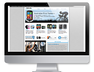
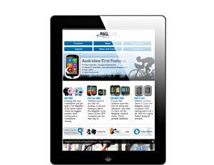
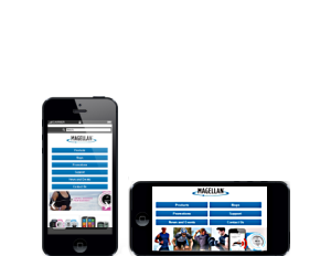
In days gone by, we had to build separate websites for separate platforms.
Desktop

- Large Screens
- High Resolution
- Fast Broadband
Tablet

- Home, Office or on the Bus
- Good Size Screens
- Variable Connections
Mobile

- Small Screens
- Different Orientations
- Often Slow Connections
Today, we build just one site to fill all roles.
With a PG54 responsive website, 1 size really does fit ALL
When "small screen" access was restricted to a tiny, technical, minority, it simply wasn't sound to invest any time, energy or resource on building and maintaining sophisticated mobile friendly websites.
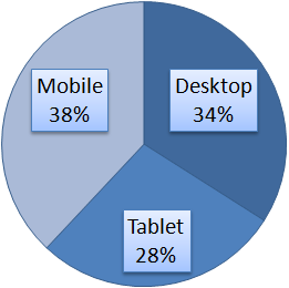
Of course, in recent times, this has all changed and the traffic served to mobile devices is often exceeding that served to desktop machines.
It's become important to have a website that conforms and adapts to the vast range of platforms and screen resolutions available today; so much so that Google now looks at and evaluates the responsiveness of websites and gives added weight to those that are "responsive".
 Typical Average Monthly Traffic Displayed by Platform


